Year
2024
Client
FMCG
Category
Product Duration
3 Weeks
Organic grocery brands often rely on predictable visual cues such as earthy palettes, rustic typography, and generic nature-inspired graphics, making it difficult to establish a distinctive identity. Growzana required a brand that felt fresh, contemporary, and culturally relevant while communicating authenticity, quality, and trust across both physical and digital customer experiences.
The brand was built around the belief that fresh food should feel energetic rather than conventional. Instead of leaning into traditional organic aesthetics, the strategy embraced bold optimism, creating a vibrant personality that appeals to modern, health-conscious consumers. Every element was designed to transform routine grocery shopping into a more enjoyable and emotionally engaging experience while reinforcing freshness as the brand's defining promise.
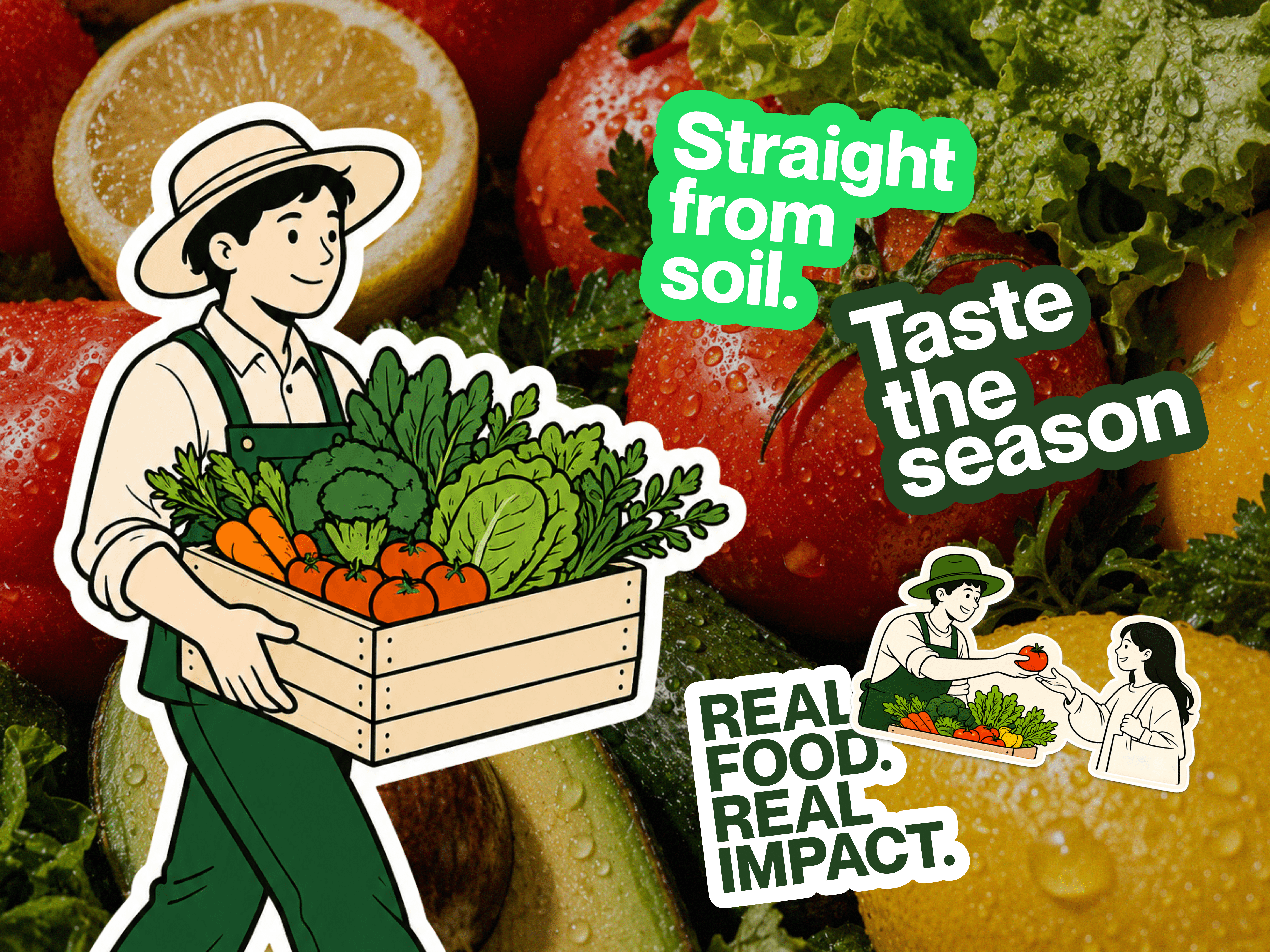
The visual identity combines bold typography, vibrant greens, warm accent colors, and a playful illustration system inspired by everyday produce and local markets. Expressive graphic elements, custom stickers, and flexible layouts create a lively visual language that adapts effortlessly across packaging, storefronts, delivery vehicles, merchandise, and digital platforms. The result is a cohesive identity system that feels welcoming, memorable, and instantly recognizable across every customer touchpoint.

Growzana transforms the perception of organic retail through a strategic identity that balances authenticity with contemporary appeal. The brand system builds trust while creating a distinctive presence in a competitive market, providing a scalable foundation for future expansion across new products, retail environments, community initiatives, and digital experiences.